Saturday, December 28, 2013

Anitations: "Wash your Hands", Rushmore (1998)


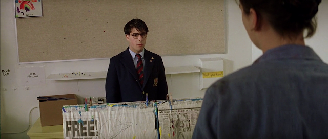
Shortly after Max Fischer (Jason Schwartzman) gets kicked out of Rushmore, Ms.Cross (Olivia Williams) resigns from teaching at Rushmore. In this scene, Max's delusions of having a romantic relationship with Ms.Cross are shattered when she makes it clear that she has no interest and mocks Max's intentions.


I chose this scene because its shots are different from Wes Anderson's style which he uses in all his feature films and is often parodied for (notably in this SNL Halloween Special). Despite its deviation, this scene still stays very true to Anderson's style, and a small "wash your hands" sign is evidence for that which I will get into later. But first, it is important to be familiar with how Anderson typically stages his shots.

A vast majority of Anderson's shots throughout his films are head-on or profile. To some, this approach of shooting is off-putting and even downright unsettling. However, this approach does a few things for Anderson:

  • It is an homage to classical theater, even down to having a play within a film as seen in Rushmore and Moonrise Kingdom (2012). (fig.1)
  • It helps give an artificial feel to Anderson's stories, where the delusions of characters are a central flaw and source of conflict. (fig.2)
  • It helps the audience understand the relation of setting to the character(s).
 (fig.1) Plays within films, as seen in Rushmore and Moonrise Kingdom

(fig.2) Captain Zissou in The Life Aquatic (2004) tries to fabricate a life full of adventure and drama through his documentaries. Anderson does not hide the fact that much of Zissou's boat is a film set.

In this Rushmore scene, the camera is hand-held for all shots here, as opposed to Anderson's usual profile/head-on with cameras mounted on dollies and cranes. I also realized that this method of shooting is used by Anderson when the delusions of a character are broken, sometimes during a chaotic event that forces a character out of their comfort zone. (fig.3)


(fig.3) Death and loss provide a sobering realization for Anderson's characters, notably in Life Aquatic and The Darjeeling Limited (2007)

However, Anderson does not break from his style completely in this Rushmore scene. He is still very deliberate in how the shots are composed and uses the space for the sake of narrative as a play director would. The way Cross uses the easel as a barrier and how Max gets talked into a corner is classic theater (fig.4,5), while the words "wash your hands" and "free" on Cross' shoulder at start and finish is no coincidence and reflect Cross' state of mind (fig.4,6); a testament to Anderson's meticulous style.

(fig.4) Above Cross' shoulder is a "wash your hands" sign. While not out of place in this classroom setting, it subtly reflects her state of mind. It is an old expression of one ridding themselves of responsibility for someone else's life. One of the most notable uses is in the Bible, where Pilate sends Jesus to the crowd to be judged and executed (Matthew 27:24

(fig.5) Max gets backed into a corner. While there is space outside, he is still trapped. This backdrop with all the fish tanks is a reference to the aquarium Max tried to build for Ms.Cross in an effort to win her over but got him expelled. It is a visual play on the mess he got himself into.

(fig.6) With Max gone, Cross is free. Is the word over her shoulder there by coincidence? I hardly think so.

As seen with Anderson's deliberate use with of themes in licensed soundtracks for his films, such as betrayal in Rushmore with "Oh Yoko" by John Lennon, nostalgia in The Fantastic Mr.Fox with "Balled of Davy Crockett" and "Love" which were Disney movie originals, and a sense of absolute uncertainty in the opening of The Darjeeling Limited with "This Time Tomorrow" by The Kinks, Anderson has a blunt yet subtle way with the presentation of words in his films, scattered throughout like Easter Eggs.

Saturday, December 7, 2013

Anitations: "Let it Go" from "Frozen" (2013)


I lied.

I said my next Anitation entry would be from Metal Gear Solid: Ground Zeroes, but Disney Animation just released the animation sequence for "Let it Go" from their most recent feature Frozen. I love this film and I love this song, so how could I not say no to studying it?

This Anitation will focus on studying the eye trace of the sequence. The Eyetrace will be highlighted with a rectangle on screen. Sorry, the sound is absent because it can be distracting and it would violate audio copyright terms of YouTube if left in. The original video will be found here as long as Disney decides to keep it on their YouTube Channel.

.

Friday, November 22, 2013

[Preview] Anitations: "Metal Gear Solid, Ground Zeroes"


Hello and welcome to my second Anitation, where I study animated film and break it down
. I couldn't resist anitating the opening credit footage for "Metal Gear Solid: Ground Zeroes"  for two reasons:

  • This opening credit footage is one continuous shot nearly 10 minutes in length. "Unbroken Shots" are uncommon, bold and difficult to do well, and have been used by Alfred Hitchcock and Alfonso CuarĂ³n (Children of Men (2006), Gravity (2013)). I'm curious as to how this continuous shot plays with composition.
  • I'm a huge fan of the Metal Gear Solid series, and am excited for Kiefer Sutherland's performance as actor (voice and face-motion) for the main character, Snake.

In the previous annotation, I wrote what basically became an analysis paper over 1,000 words in length. This time, I am going to do a series of clips with my notes inserted within. Here's a preview of what's in store:


Here's the original footage in full, recently released and featuring part of the English vocal cast:


Thursday, January 31, 2013

Anitations: Paperman (2012)

Anitation? Annotated Animation, of course! Inspired by lectures of Steve Hickner, I aim to become much more sensitive to the importance of of space and pace in film, as well as become more articulate in sharing what I have learned about it. To achieve this, I want to share studies, notes and observations with the occasional Anitation entry.

With that, I would like to begin with Disney's Paperman (2012).


 If you have not watched Paperman, you can see it on Disney Animation's official Youtube page here.  Stories of two meeting by what almost seems like fate are fairly common and I'm usually critical when it comes to the application of magic as a pivotal story element. But a sense of wonder Disney studios is known for can let an audience suspend disbelief, and I know I'm not the only one who was moved because Paperman was so beautifully done.

To get a better idea what made Paperman work, I had the fortune to squeeze into a panel discussion about this film at Creative Talent Network (CTN) 2012, which included John Kahrs (Director), Jeff Turley (Art Director), Patrick Osborne (Animation Supervisor) and Sarah Airriess (Line Supervisor). I took several notes and have been eager to share them, but waited for an official release of the short because I wanted to pick the best screen stills to supplement this post. I will divide the notes into two parts:
  1. Inspiration and development
  2. Values and Compositions
Inspiration and Development

Kahrs says his inspiration came from his time living in New York City, where everyone is looking for a connection, and so many opportunities are missed because the daily commute separates people as quickly as it brings them together (fig.1). Kahrs wanted to make a story where magic, if not fate, could bring two strangers together in this setting: 1950's NYC, a familiar place and time not too far away where magic could happen.

fig.1: As two strangers part ways, a connection is made

During early development, Kahrs wanted to find a way to preserve the "raw artistic energy" of the concept art (fig.2 and fig.3). He wanted this short to feel integral to the legacy of traditional drawn animation that was used to create many Disney Classics. While the technology used to achieve the hand-drawn feel was not discussed thoroughly at the panel, there are videos on Youtube describing its application (fig.4).


 Fig.2

Fig.3


 fig.4: Breakdown of the tools used in Paperman

Side note: When I saw George, I felt that I saw that untidy hair and those exaggerated facial features somewhere before...(fig.5). It turns out that Glen Kean was involved in the character design of Paperman. Glen Kean is a master animator known for supervising the animation of Disney characters including Arial (Little Mermaid, 1989), Beast (Beauty and the Beast, 1991) and Aladdin (Aladdin, 1992).

fig.5

Values and Compositions

Given the length of the film, the visual presentation has to be extremely clear. So,
when it comes to values and compositions, the design philosophy used in Paperman is pretty simple for the most part by necessity; dynamic camera work and visual stunts would only serve to confuse the audience. Its brilliance lies in how it stays absolutely consistent to these simple rules to the point that the average viewer won't even notice.


fig.6: George's side of the world is gray, punctuated with darkness by his boss who takes up an oppressive presence on the screen

fig.7: Meg's side of the world is noticeably brighter than George's


fig.8: George's emotional downs and black moment are very straightforward as well, with him standing or walking in shadow

However, at the film's climax, an unusual method of cutting and arrangement of composition is used: a "strobe effect", as Jeff Turley calls it. The following is a portion of the series of cuts used in the climax. Note how they invert in value (George's shots show a light figure against a dark background while Meg's shots show a dark figure against a bright background). This contrast in visual flavor between cuts heightens the pace of the cuts without reducing their time.


Another simple method that is done with great execution can be seen in the movement and composition of the film: the movement between left and right. In the opening shot, George is standing alone to the left the foreground. There's an empty space to the right, which Kahrs describes as the void in George's life. Meg comes in to stand in that space for a moment (fig.9). 

 fig.9

As Meg leaves, she travels to the right, away from George, setting this pattern in motion. Up until the climax, Meg will always be oriented to the right while George is oriented on the left. All of George's attempts to get Meg's attention will consistently be cast from left to right, whether it be waving, throwing paper airplanes or running in the false climax. (fig.10). Note that the montage of George's paper-throwing attempts are shot at different dynamic angles, which helps convey frustration and "breaks the rules of the chase to confuse the audience."


fig.10

As George gives up, he begins to move to the left of the screen; away from Meg. As George walks alone in the shadow, fate intervenes and begins moving him to the right, into the light and towards Meg (fig.11). Fate also begins moving Meg to the left, towards George (fig.12)


fig.11

fig.12

fig.13

The closing shot (fig.13) shows the widest range in values. George and Meg are at a composition similar to the opening shot (fig.9), pretty much back to where they started. However, they are standing a little closer and facing each other.

In closing

Animated Film is arguably a pure screen art; moving pictures made from scratch, where every motion, stroke and color is part of the final product for a specific purpose. I want Anitations to be part of a greater dialogue. I humbly welcome your input and (especially) any thoughtful disagreements, so please do share!

Something to Show for in My Absence

Here is the final project for ANI 114 "Animation" of Fall 2012 at SJSU. The assignment: create a story about a flour sack character that interacts with an inanimate object and experiences a change in emotion.


While that was fun, I have to say the most rewarding project I have worked on in the Fall was "Roll" because of all the great people I got to work with and how well received it was. The director, Youri Dekker, has written well about the making of this short.


Thursday, June 28, 2012

Job Title: Set Designer

It feels like it's been days since I last sat down.

I am currently interning with the award-winning Spartan Films Studios, working on a feature-length horror film. It turns out my basic shop safety know-how, my freshman-level training in draftsmanship, and competence in 4-function arithmetic have qualified me for the job of Set Designer.

I have never worked on something this large in scale and with so many people. And to be put into a leadership position within the first two weeks. It's been hectic and deadline looms, but it has been fun so far.

The set I have been working on for the past two weeks is being constructed in the basement of the University Theater at SJSU. I was charged with recreating the basement to scale in Google Sketchup, from every pillar to every pipe. Then I had to find a way to make a set for the film that would fit in the tangle.


Basement Before
Preliminary Set Design

So far, the construction efforts have presented a lot of challenges. And thanks to the enthusiastic and hardworking crew, a lot of progress has been made! Here's hoping we meet deadline!

A number of photos of us building the set can be found here!


Sunday, June 3, 2012

Day 1 (?)


I will start off this blog with my portfolio that got me passed review to the BFA Animation/Illustration program at San Jose State University this Spring. I hope to keep this blog updated with my journey in learning how to be a better animator (which I hope lasts for the rest of my life). Thanks for stopping by!